Client: AT&T Date: 05/2011 Role: A/B testing and Graphic designer
Summary
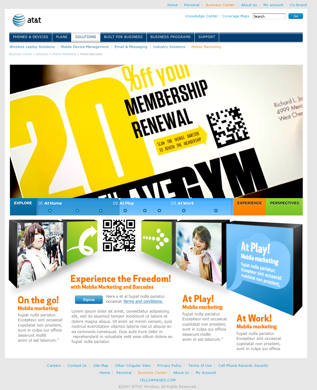
I designed many strategic well-flowing landing pages for AT&T that allows the business to send traffic from other marketing channels, like emails, and convert them into visitors. I enjoyed pushing creative boundaries while respecting brand guidelines, incorporating unique design elements like backgrounds and the use of AT&T’s signature orange and other elements.
Solution
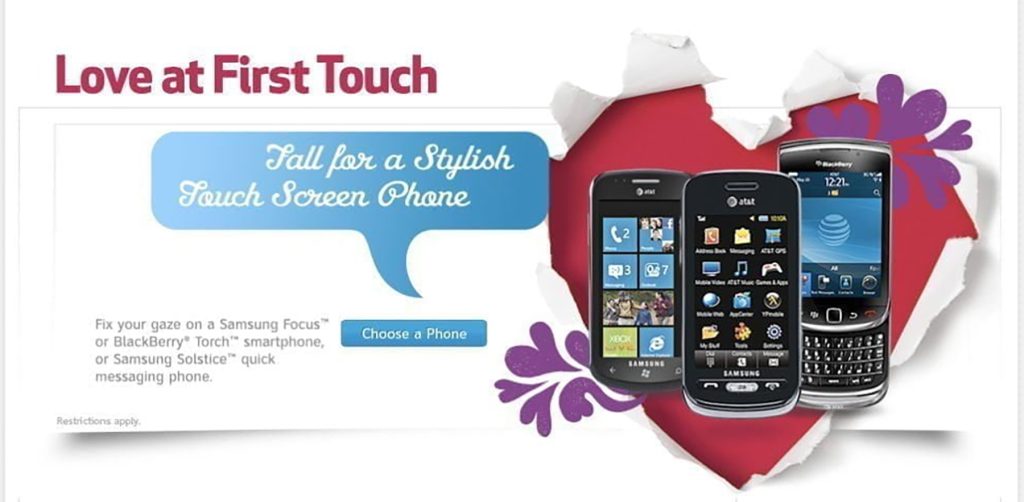
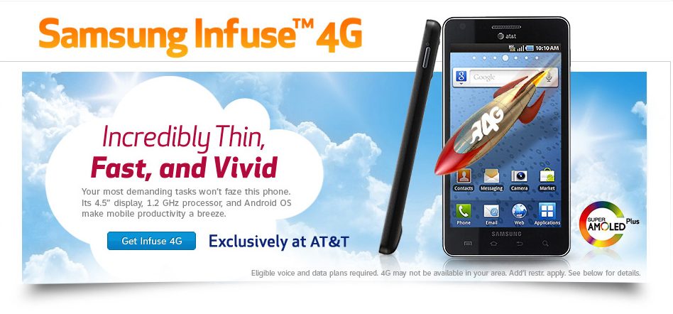
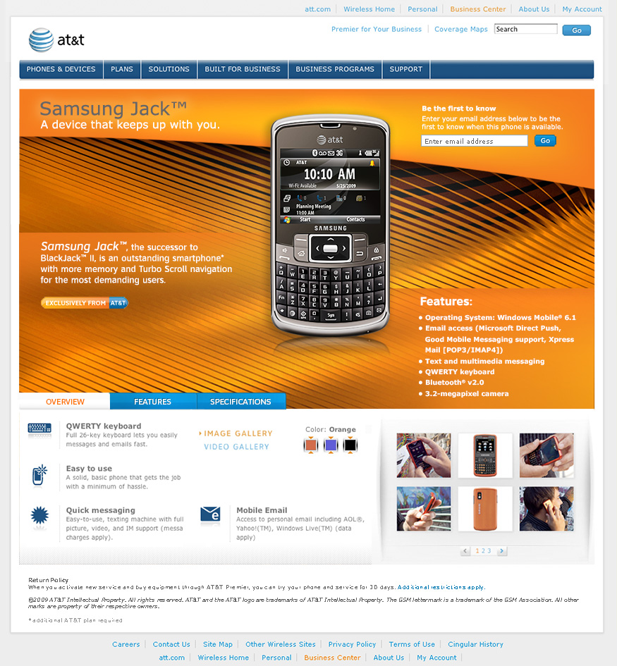
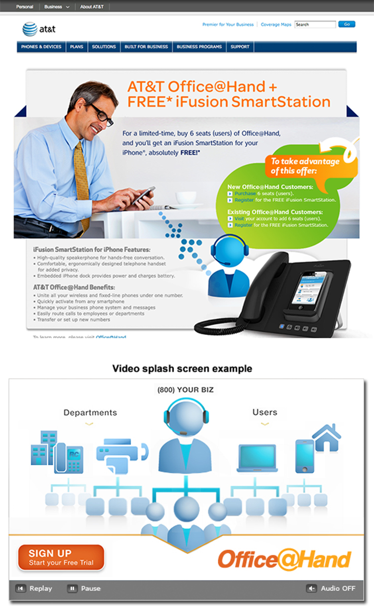
These headers were carefully designed to align with AT&T’s brand identity while also introducing fresh visual elements to make the pages stand out, ensuring that the messaging was clear, concise, and persuasive. This was the era of the touch screen evolution. Blackberrys were holding on but disappeared two years after this promotion.
Structured around three core objectives:
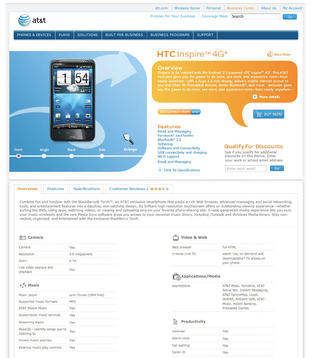
Provide Detailed Product Information: Visitors needed to understand exactly what the product was, how it worked, and why it was valuable. This involved clear descriptions, specifications, and contextual information that helped users make informed decisions.
Showcase Features and Benefits: Beyond just the basics, the pages highlighted key features and benefits that differentiated AT&T’s offerings from competitors. This included visual elements like icons, bullet points, and imagery to make the information easy to digest.
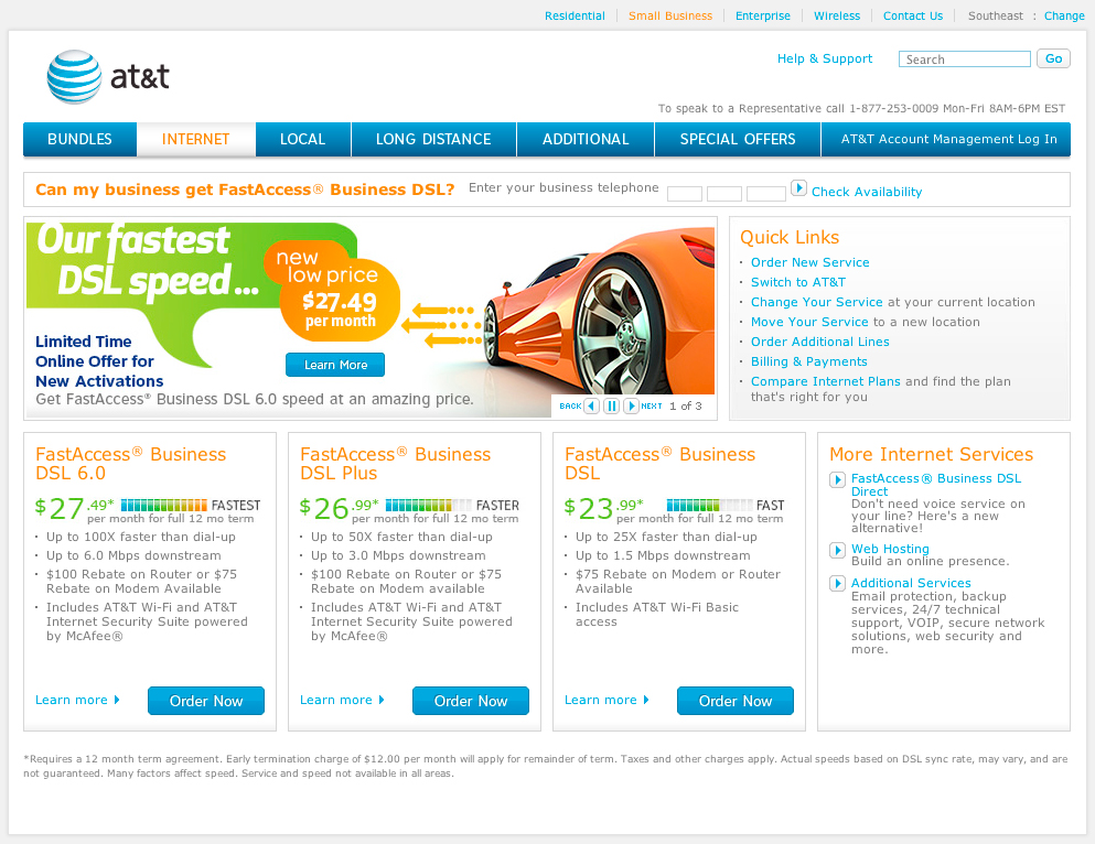
Encourage Action: The ultimate goal was to drive conversions by incorporating strong calls to action (CTAs), such as signing up for a service, requesting more information, or reading customer reviews. These CTAs were strategically placed to guide visitors through the page and prompt engagement.
This balance of innovation and brand consistency helped create landing pages that were not only visually appealing but also effective in meeting business goals.
Additionally, I developed quick mockups of new design ideas to explore potential future directions for the brand’s digital presence.
Older Brand Identity
Our branding at AT&T was more corporate prior to the above overhaul. I really liked pushing the limits, while maintaining the brand references in the design. The slits in the background create an interesting design element to capture attention. I match AT&T orange and used the swoop across the top. This was a brand element before the new styling that came later, featured above with big splashes of color.
UX/UI Designer using Agile/Lean UX and SAFe Methodologies to quickly move from concept to launch, iteratively collecting user feedback for ongoing improvements to the users’ experience; specialize in multichannel, large data-driven enterprise systems.