![]()
Client: XPO Logistics Date: 02/2019
Role: Product Design, Lean UX, Researcher, Note Taker. Managed offshore UI designer.
Project Summary
A delivery exception happens when an ecommerce package is delayed temporarily in transit. When trouble occurs during the package’s progression, resulting in the intervention of the fulfillment process, numerous things can go wrong even with the most complex and robust ecommerce system. Delivery exceptions need to be handled with care because they ultimately have a direct impact on operations downstream.
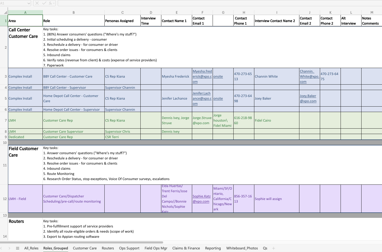
User Research: Personas by role and department
In-field Research: Design Failure and What We Learned
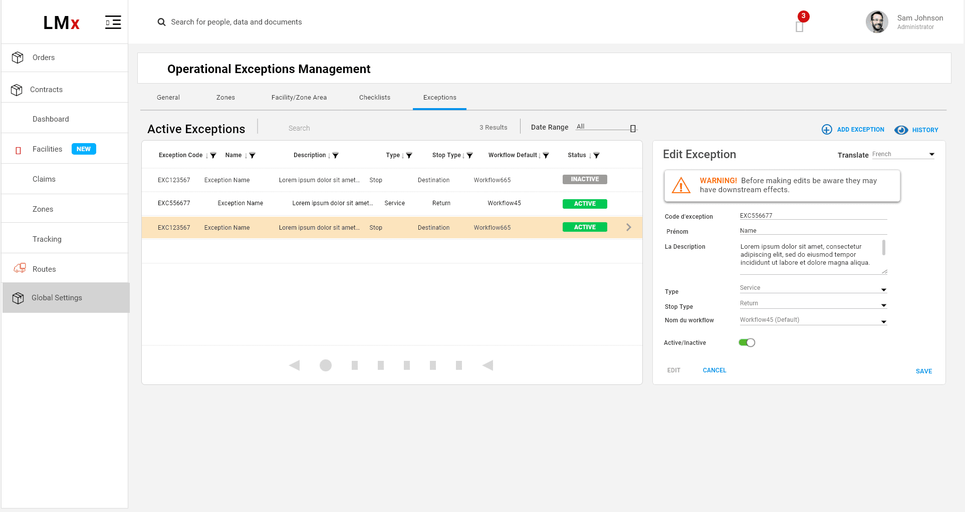
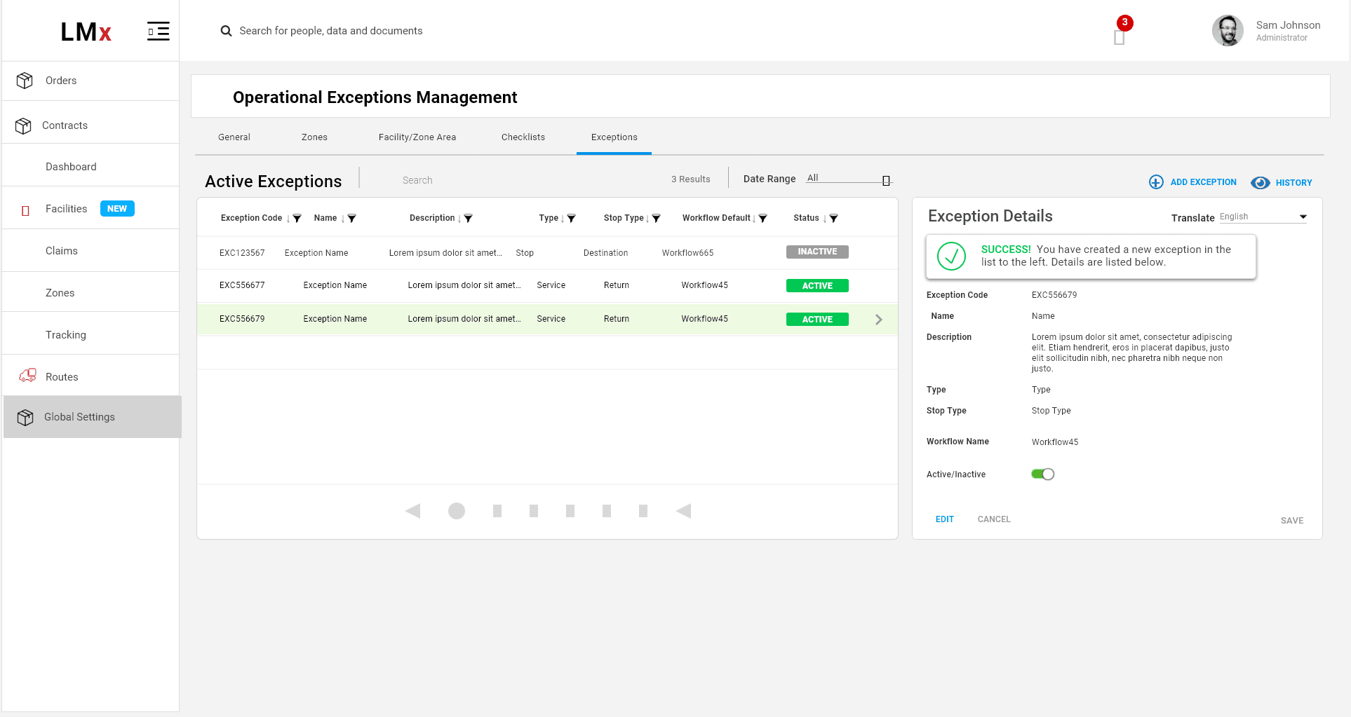
Call centers handle user inquiries about delivery delays. When a customer service representative creates a delivery exception, it automatically triggers actions to track the package’s status. However, users were not making the connection between their selection and the data displayed in the table on the right. Adding a chevron icon did not help, and users lost trust, often double-checking the information.
This was my first attempt at designing connected inline data trays at XPO Logistics. The tray did not visually link the selected item to its corresponding data, partly because browser resizing cut off key UI elements that created this connection. We couldn’t identify the cause until we conducted in-field research, observing call center staff in their actual work environment rather than a controlled testing setting. We discovered that agents had multiple windows open, forcing them to resize our application, which broke the visual connection.
To address this, we integrated contacts—previously managed in a long Excel file—directly into the application for escalations, allowing users to see everything in one window. This solution emerged only because we went onsite and saw how the app was truly used. It highlighted how the user environment can be an unexpected factor affecting usability.
Since then, I have improved the data trays to clearly connect selected items with their slide-out details. With proper UI styling, this remains an effective way to display large amounts of information inline. Experiencing users’ real-world context deeply influences how we design digital interfaces.
For example, the ValGenesis app was designed for environments without internet access, which initially seemed unrelated to UI design. But after learning that users often work in very dark or very bright rooms, we increased contrast. Users wear surgical-style gloves and use touchscreens with protective covers that can get dirty, so buttons and CTAs needed to be bold and large. What might look like simple blocks of bold color actually serve a critical usability purpose.
Ultimately, every design decision should be grounded in real-world usability.
Data-tray example for Delivery Exceptions
I first worked on basic UI styling. XPO was committed to using Material Design UI Kit. I introduced “Flat 2.0” which was gaining popularity, combining elements of flat MUI and dropping a shadow in key places where more emphasis was needed Keep users inline where they are in the flow, without navigating them away or distracting them with overlays or popups.
I focused on clear system feedback.