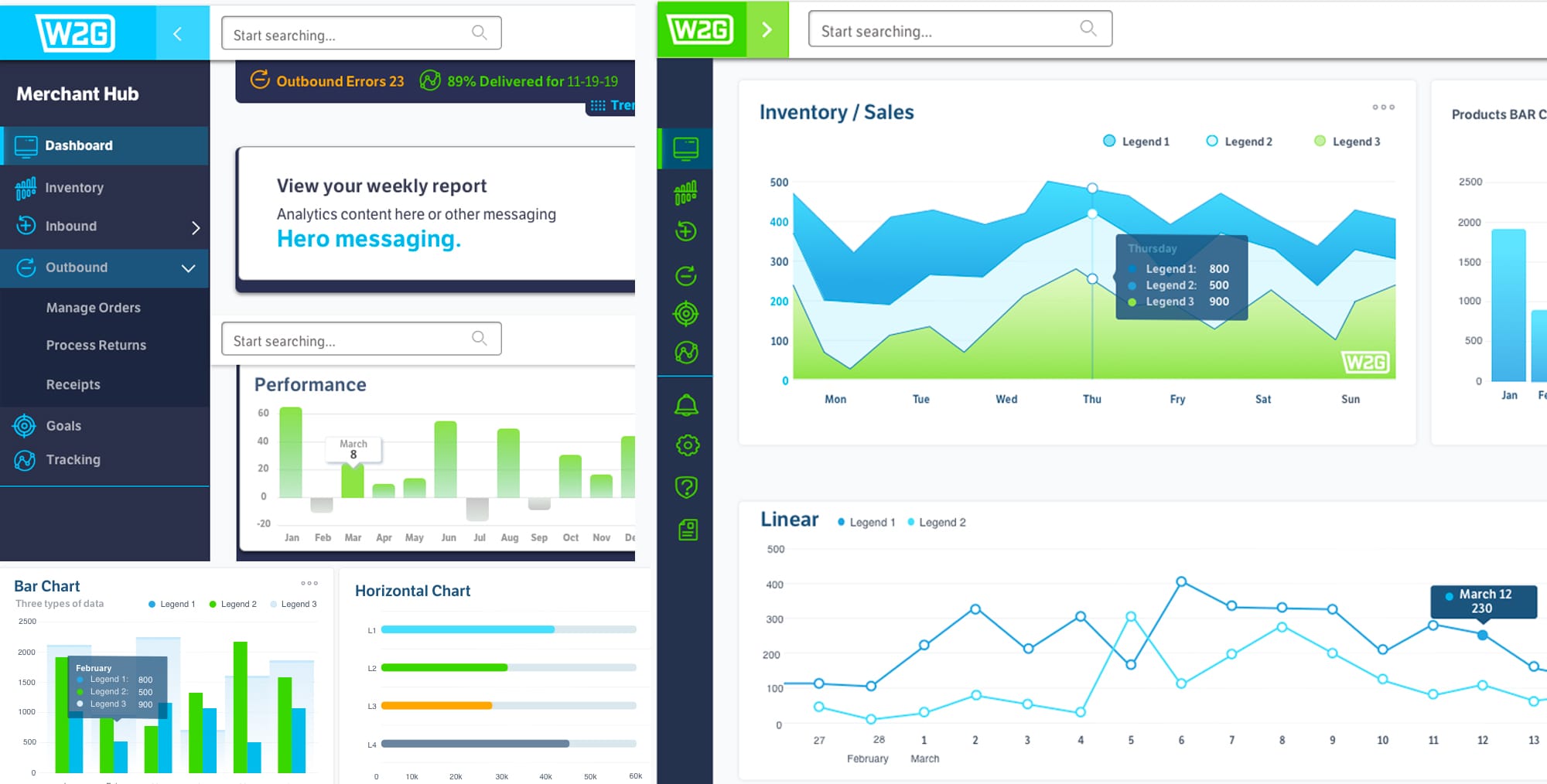
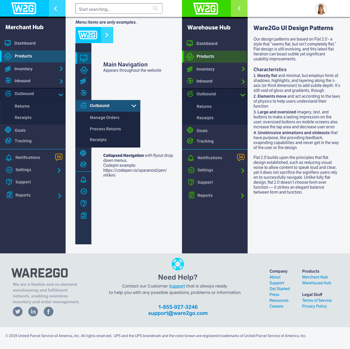
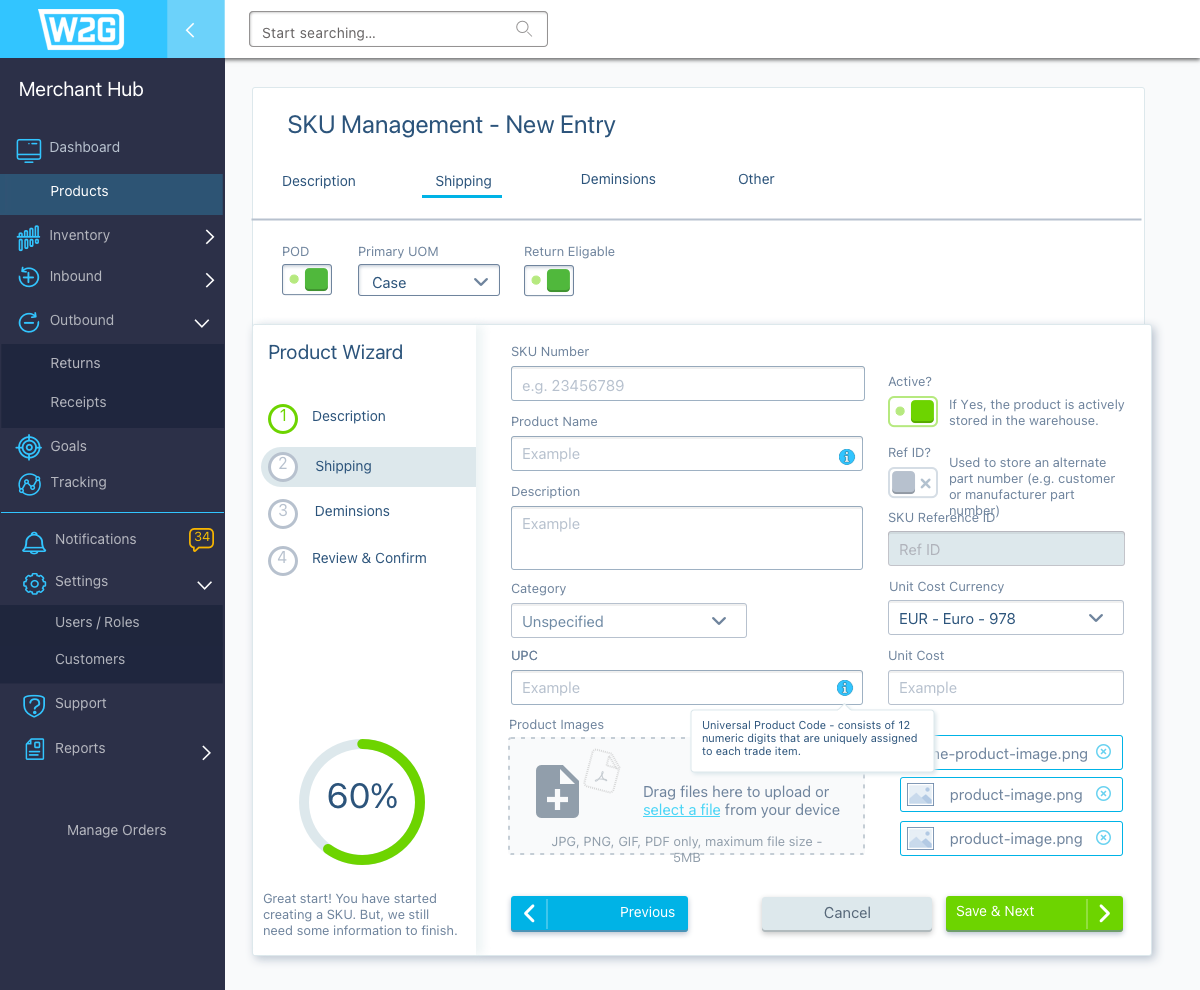
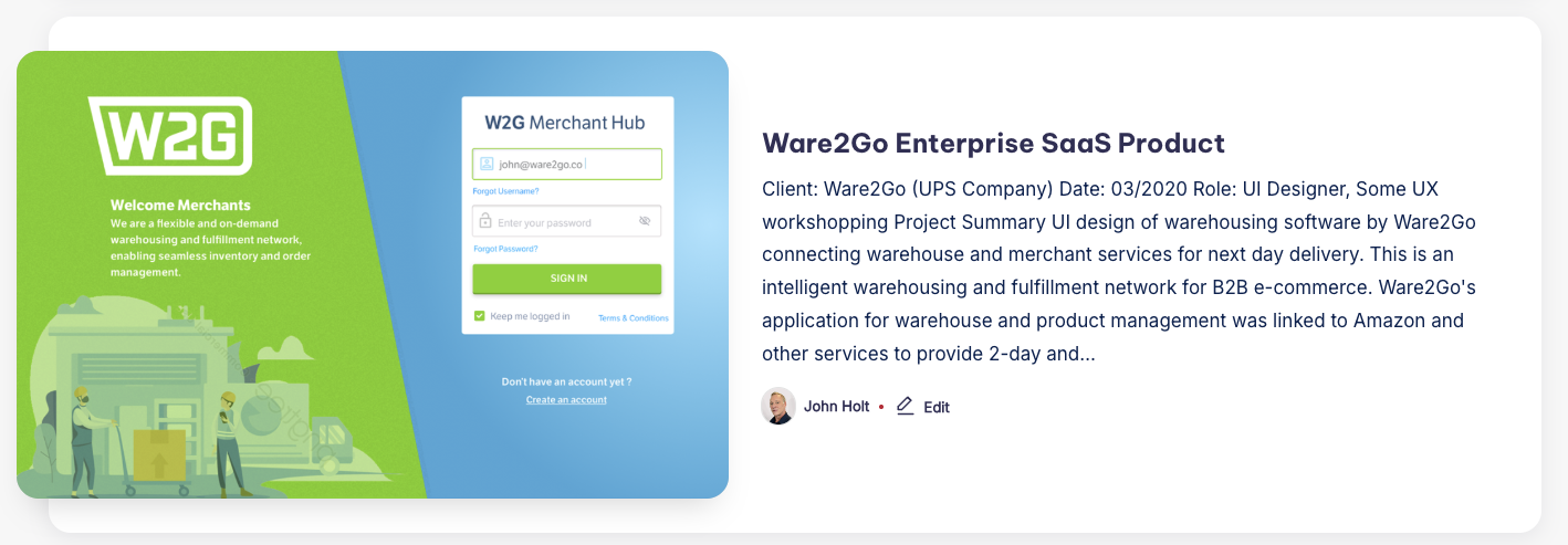
| A good visualization of the data can give powerful insights to the users. The system was not providing real-time insight into the current state of the most important metrics of the system like inventory. The dashboards had multiple views, each without a clear purpose. Ware2Go is an intelligent warehousing and fulfillment network for B2B e-commerce. Interface pain-points: UI did not enable users to make instantaneous and informed decisions at a glance. They cannot monitor the major functions of system performance efficiently. There is no indication of what items require urgent attention at the top and move less critical statistics to the bottom. A good dashboard is simple, communicates well, has a minimum of distractions and presents information visually so it is easily understood. | Ware2Go Ul Design Patterns Our design patterns are based on Flat 2.0 – a style that “seems flat, but isn’t completely flat.” Flat design is still evolving, and this latest flat iteration can boast subtle yet significant usability improvements. Mostly flat and minimal, but employs hints of shadows, highlights, and layering along the z-axis (or third dimension) to add subtle depth. It’s still void of gloss and gradients, though. Elements move and act according to the laws of physics to help users understand their function. Unobtrusive animations and slide-outs that have purpose, like providing feedback, expanding capabilities and never get in the way of the user or the design |